
Designing KPIs that Drive Action
Key Performance Indicators (KPIs) are among the most frequently cited tools for translating strategy into measurable outcomes. Yet many organizations struggle to design KPIs that actually change behaviour. Too often dashboards display a long list of numbers that look authoritative but produce little operational improvement. The difference between a set of metrics that informs and one that transforms lies in intentional design.
How businesses can make smarter choices, reduce risks, and uncover opportunities by relying on data instead of intuition.

Why KPIs Fail
KPIs fail for a few recurring reasons: they’re vague, they’re disconnected from strategic outcomes, they’re not owned, and they create noise rather than focus. Organizations may gather data simply because it’s available, not because it meaningfully measures progress toward an objective. Or they overload teams with metrics that dilute priorities.
Principles for Building Actionable KPIs
Designing KPIs that drive action requires discipline. Below are core principles that combine strategic clarity with practical execution.
- Link KPIs directly to strategy. Every KPI must have a line of sight to a strategic priority. If increasing customer lifetime value (CLTV) is a strategy, then KPIs should include retention rate and average order value—not vanity metrics like page views.
- Use SMART criteria. Specific, Measurable, Achievable, Relevant, and Time-bound KPIs are easier to manage. Replace vague goals with targets, deadlines, and clear measurement approaches.
- Balance leading and lagging indicators. Lagging indicators (revenue, profit margin) tell you what happened; leading indicators (pipeline velocity, training hours) tell you what will likely happen. Using both helps teams act proactively.
- Assign ownership and define actions. Each KPI needs an owner and playbook: who is responsible, and what steps are taken if the metric slips.
- Limit the number of KPIs. Focus on the vital few. Too many indicators spread attention thin and reduce effectiveness.
Practical Framework to Implement KPIs
Use a four-step process: (1) Translate strategy into measurable goals; (2) select candidate metrics; (3) validate data quality and frequency; (4) set targets and escalation paths. Iterate every quarter to ensure KPIs remain aligned with evolving priorities.
Example: Manufacturing Use Case
A milling plant focused on improving throughput might be tempted to track machine runtime as the primary KPI. But machine runtime alone ignores quality and output. A more effective KPI mix could be:
- Unplanned downtime percentage (leading)
- Yield per hour (lagging)
- On-time delivery rate (lagging)
- Maintenance compliance rate (leading)
Each of the above points to specific actions (maintenance scheduling, operator training, supplier management), and each has a defined owner.
Visualization and Communication
Visuals matter. Present KPIs in a dashboard that highlights status (green/amber/red), trend, and short contextual commentary. A KPI tile might show current value, target, trend over time, and a one-line commentary: “Action: schedule root-cause analysis for shift B.” This converts passive numbers into active prompts.
Governance and Continuous Improvement
Set a governance cadence: review KPIs monthly and reassess quarterly. Remove metrics that don’t inform decisions. As the business evolves, KPIs should evolve too—reflecting new priorities, changing markets, and improved data maturity.
Conclusion
KPIs that drive action are concise, strategic, owned, and visual. They catalyse decisions instead of merely summarizing them. Start by aligning KPIs to strategy, pick the vital few, and embed clear ownership and action plans. With this approach, KPIs will shift from being scorecards to being the drivers of performance improvement.
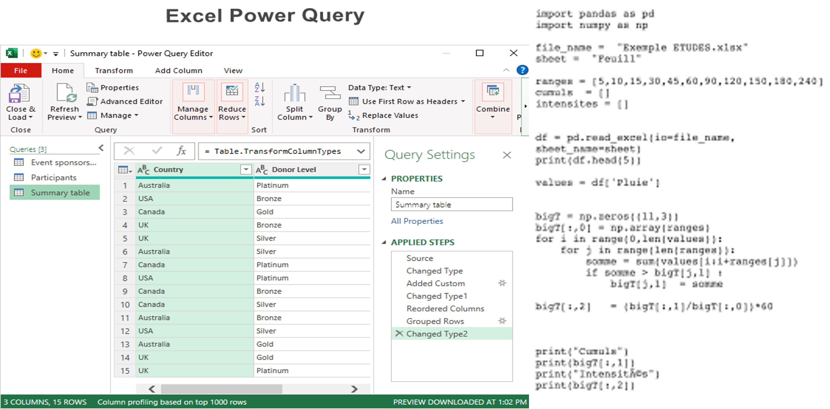
Faster Reporting with Power Query
Automation eliminates repetitive tasks, increases accuracy, and empowers teams to focus on high-value work.
Timely and accurate reporting is the backbone of effective decision-making, yet many organizations still rely on manual workflows that consume valuable analyst time. Power Query transforms how teams collect, clean, and consolidate data, turning hours of repetitive work into a repeatable, auditable process.

The Cost of Manual Reporting
Manual data preparation introduces errors, creates version control issues, and consumes time that could be used for analysis. Analysts often repeat the same transformations each reporting period, leading to low-value activity and higher frustration.
What Power Query Does Best
Power Query provides a GUI and a scriptable language (M) to extract, transform, and load (ETL) data within Excel and Power BI. Key capabilities include:
- Connecting to many data sources (files, folders, databases, APIs)
- Cleaning operations (deduplication, fill-down, replace values)
- Reshaping data (pivot/unpivot, split columns)
- Combining datasets (merge/append) with incremental refresh options in Power BI
Designing Repeatable Queries
Best practice is to build modular queries: a staging layer for raw data import, a transformation layer for cleaning and enrichment, and a presentation layer that feeds the final model or Excel tables. This structure improves maintainability and debugging.
Real-World Example
In a retail environment, regional managers send daily CSVs with sales records. An analyst built a folder-based Power Query that ingests all files, normalizes SKU codes, calculates channel revenue splits, and outputs a consolidated table. What used to take 6 hours per week now runs as a one-click refresh.
Power Query + Power BI: A Powerful Combo
Using Power Query in Power BI enables scalable, scheduled refreshes and interactive dashboards. With proper data modelling (star schema) and DAX measures, teams can create performant, user-friendly reports that update automatically.
Governance and Documentation
Document transformation steps and key assumptions. Use source control for M queries where possible and maintain a data dictionary so consumers understand definitions and lineage.
Practical Tips
- Use descriptive names for queries.
- Disable load for staging queries to keep models lean.
- Validate at each step to catch bad rows early.
- Profile data using the Power Query data profiling tools.
Conclusion
Power Query reduces time-to-insight by automating tedious transformations and providing a reproducible path from raw data to actionable information. Investing in well-structured queries and documentation delivers tangible time savings and more reliable reporting.
Unlocking Business Value with Data Visualization
Turn raw nzumbers into powerful stories that drive better and faster business decisions.
Data visualization is more than making charts look pretty. It’s a way to surface the right insight to the right person at the right time. The most effective visualizations turn complexity into clarity and enable faster, more confident decisions.

Introduction
Why Visualization Matters
Our brains are wired to detect patterns visually. A well-designed dashboard reduces cognitive load and highlights the few signals that require attention. Visualization also democratizes insights—enabling non-technical stakeholders to engage with data meaningfully.
Design Principles
Follow pragmatic design principles:
- Purpose first: Each chart must answer a question.
- Choose the right chart type: Trends (line), comparisons (bar), composition (stacked bar or pie, used cautiously), distribution (histogram).
- Use color with intent: Color should guide attention, not decorate.
- Contextualize: Show comparisons, targets, and commentary to explain anomalies.
Dashboard Layout and Flow
Structure dashboards top-to-bottom: summary KPIs, trends, drivers, and then detailed tables for operational users. Make filters and slicers obvious and consistent. Avoid redundant views that confuse users.
Example: Cross-Functional Dashboard
A cross-functional operations dashboard might include: overall throughput KPI, trend charts for production and downtime, a Pareto chart of top defect types, and a table listing corrective actions with owners. This layout enables both quick checks and deeper root-cause analysis.
Tools and Implementation
Power BI, Tableau, and Looker are common choices. The tool matters less than the data model and design discipline. Ensure you have clean, documented data and a governance process to maintain dashboards over time.
Advanced Techniques
Consider using small multiples for comparing many similar items, sparklines for trend context within tables, and drill-through functionality to move from summary to transaction-level detail. Annotations and dynamic commentary can dramatically improve comprehension.
Conclusion
Visualization is how data becomes action. With clear purpose, disciplined design, and the right tooling, businesses can unlock value from their data and encourage a culture of insight-driven decisions.
Building a Scalable Supply Chain with Analytics
Learn how analytics ensures growth, resilience, and efficiency in supply chain operations.
Scaling a supply chain without analytics is like navigating a storm with no radar—you're likely to encounter unexpected turbulence. Analytics brings foresight, enabling organizations to optimize inventory, forecast demand, and respond rapidly to disruptions.

Major Challenges When Scaling
As organizations grow, they face greater variability in demand, longer supply lines, and more complex supplier networks. Common issues include stockouts, excess safety stock, poor service levels, and limited visibility into supplier performance.
Analytics Capabilities to Prioritize
- Demand forecasting: Statistical and ML models that incorporate seasonality, promotions, and external signals.
- Inventory optimization: Techniques to set reorder points and safety stocks based on service levels and variability.
- Supplier performance analytics: Scorecards tracking lead time, quality, and cost.
- Network optimization: Placement of inventory across facilities to balance cost and service.
Implementation Roadmap
- Centralize data: Bring transactions, inventory, and supplier data into a single platform.
- Start with pilots: Choose a product family with clear seasonal patterns and pilot forecasting models.
- Operationalize: Implement reorder automation and supplier alerts based on analytics output.
- Govern: Set KPIs for forecast accuracy, fill rate, and working capital, and review them regularly.
Example Case Study
A mid-sized food processor faced fluctuating demand across regions. Implementing a forecast-driven procurement process and optimizing SKU placement cut inventory by 18% while improving service levels. The company moved from reactive firefighting to planned replenishment cycles.
Key Organizational Considerations
Analytics is only useful when teams trust and use the outputs. Invest in change management: training for planners, transparent scorecards for suppliers, and clear escalation paths for exceptions.
Conclusion
Analytics enables supply chains to scale intelligently. Start with data hygiene, pick pragmatic pilots, and move toward operational automation. Over time this reduces costs, improves service, and makes growth manageable.
From Excel to Power BI: Making the Shift
Why moving beyond spreadsheets to Power BI unlocks collaboration, speed, and real-time insights.
Excel has powered analysis for decades. Its flexibility is unmatched, but as businesses grow in data volume and complexity, Excel's limitations—versioning, collaboration, and scalability—become apparent. Power BI addresses these challenges by offering centralized datasets, interactive visuals, and easier sharing.

Introduction
When Excel Starts to Break Down
Warning signs include long refresh times, multiple conflicting versions of the same report, and manual reconciliation. When stakeholders can't trust or access the same numbers, decisions slow and confidence erodes.
Benefits of Power BI
- Single source of truth: Centralized models reduce discrepancies.
- Interactive analysis: Users can slice, filter, and drill down.
- Automated refreshes: Scheduled updates reduce manual effort.
- Scalability: Columnar storage handles millions of rows efficiently.
Migration Strategy
- Inventory existing workbooks: Identify critical reports and their data sources.
- Consolidate data: Move raw data into a database or OneDrive/SharePoint for consistent access.
- Recreate logic: Use Power Query to reproduce transformations and DAX for measures.
- Pilot: Build a critical dashboard and get stakeholder buy-in before wider rollout.
- Train: Provide role-based training for creators and consumers.
Example
A national retailer consolidated regional Excel reports into a Power BI dataset. Managers could now analyze sales in real time, drill into underperforming SKUs, and coordinate promotions across regions. Reporting time dropped from days to hours.
Conclusion
Shifting from Excel to Power BI is a change in mindset as much as technology. Start small, focus on high-impact reports, and invest in training and governance to ensure long-term success.
Automating Repetitive Tasks with Power Query & VBA
Save hours by automating manual reporting processes while improving accuracy and speed.
Organizations often waste analyst time on repeatable tasks—copying files, cleansing data, and formatting reports. Combining Power Query's transformation power with VBA's automation capabilities creates robust end-to-end workflows that save time and reduce errors.
Why Combine Power Query and VBA?
Power Query excels at repeatable, auditable data transformations, while VBA automates Excel-level actions: refreshing queries, applying templates, exporting files, and emailing outputs. Together they cover the full lifecycle of many reporting processes.
Typical Workflow
- Use Power Query to ingest and transform raw data into a clean table.
- Create Excel templates that reference the cleaned tables for charts and tables.
- Write VBA macros to refresh connections, apply formatting, and export PDFs or send emails.
- Schedule the macro via Task Scheduler or an automation tool for unattended runs.
Example
A logistics business automated its weekly KPI pack. Power Query consolidated data from transport logs; VBA refreshed the model, updated charts, exported a PDF, and emailed it to executives. The automation reduced manual effort from 4 hours to under 10 minutes.
Best Practices
- Keep transformations in Power Query, not in VBA, to improve maintainability.
- Use error handling and logging in VBA to notify owners on failure.
- Secure credentials and avoid hardcoding sensitive data.
- Document the workflow so it can be maintained by others.
Conclusion
Power Query and VBA together provide a practical automation strategy for Excel-first teams. Implemented well, they free analysts from manual tasks and create consistent, reliable reporting processes.
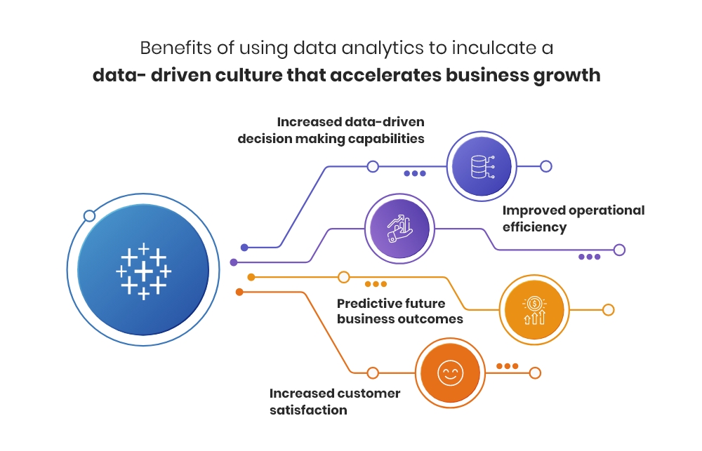
The Future of Decision-Making: Data-Driven Culture
How organizations can thrive by embedding data into every decision, building resilience and innovation.
Tools and technology are important, but culture determines whether data becomes a habit or a novelty. A data-driven culture empowers teams to use evidence in daily decisions, improving outcomes and creating competitive advantage.
Barriers to Becoming Data-Driven
Common obstacles include leadership inertia, data silos, lack of data literacy, and fear of transparency. Overcoming these requires deliberate effort and sustained leadership commitment.
Building Blocks of a Data-Driven Culture
- Executive sponsorship: Leaders must model data-based decisions and prioritise analytics investments.
- Accessibility: Make data available via self-service dashboards and clean datasets.
- Training: Build data literacy so employees can interpret and act on insights.
- Governance: Define data ownership, definitions, and quality standards.
Practical Steps
- Begin with a pilot use case demonstrating clear ROI.
- Create cross-functional teams to maintain dashboards and act on insights.
- Incentivise data-driven behaviours through recognition and KPIs.
- Scale successful pilots and codify best practices.
Example
A logistics firm introduced a daily operational scoreboard shared across sites. The visibility and routine discussion it created led to a 20% reduction in delivery exceptions within six months—the result was driven as much by regular review and ownership as by the scoreboard itself.
Conclusion
Becoming data-driven is a journey, not a project. Start with executive support, deliver quick wins, invest in people, and build governance. Over time, data will shift from being an input to being the language of decision-making across the organisation.